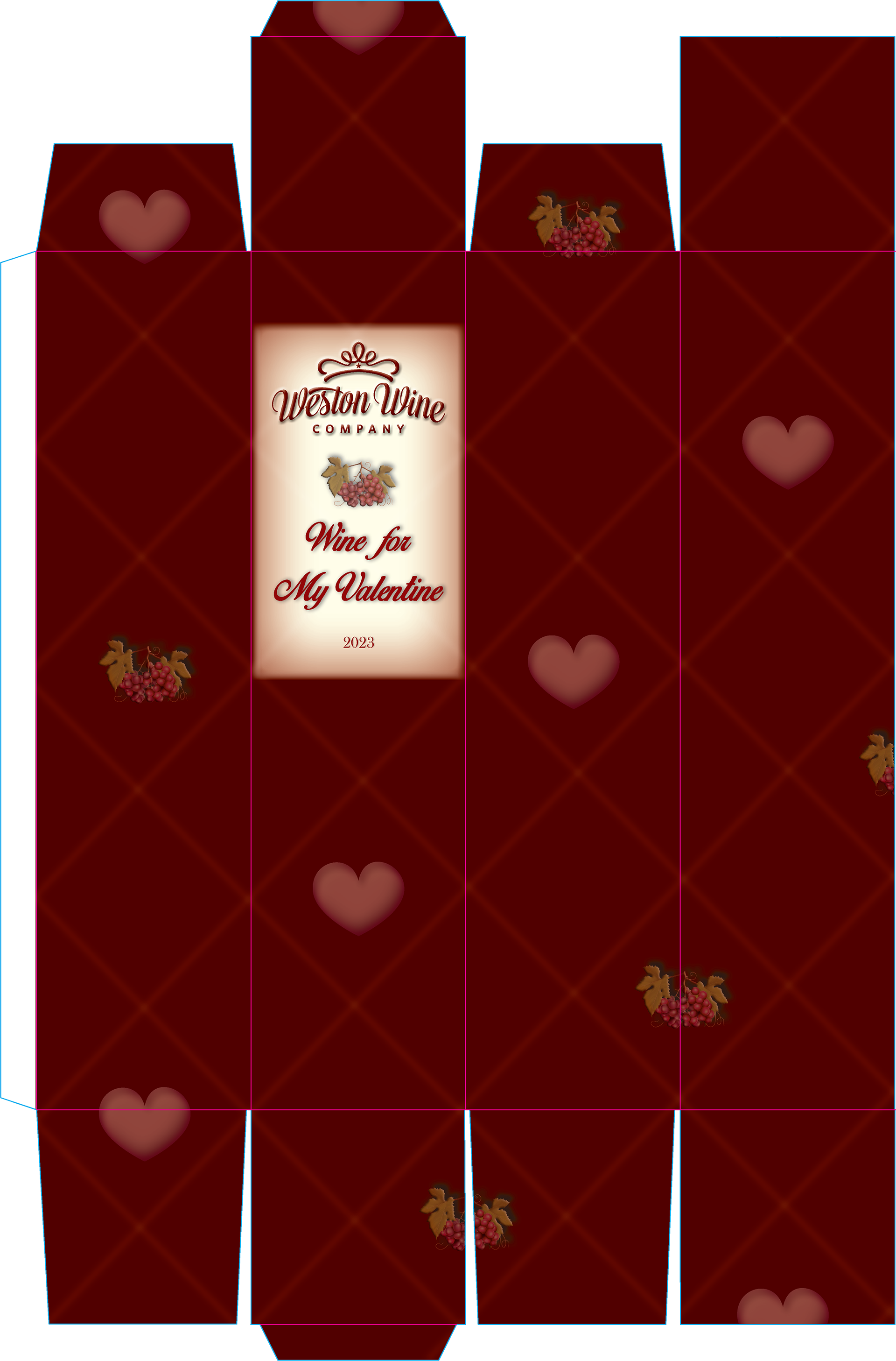
The Weston Wine Company asked our printing company to create prototypes of wine boxes and labels to test on our new digital press for potential distribution at the Weston, MO winery. The target audience was for wine connoisseurs looking for a Valentine’s Day package for their special loved ones. To be effective the box and label had to follow the brands guidelines and style guide they provided.
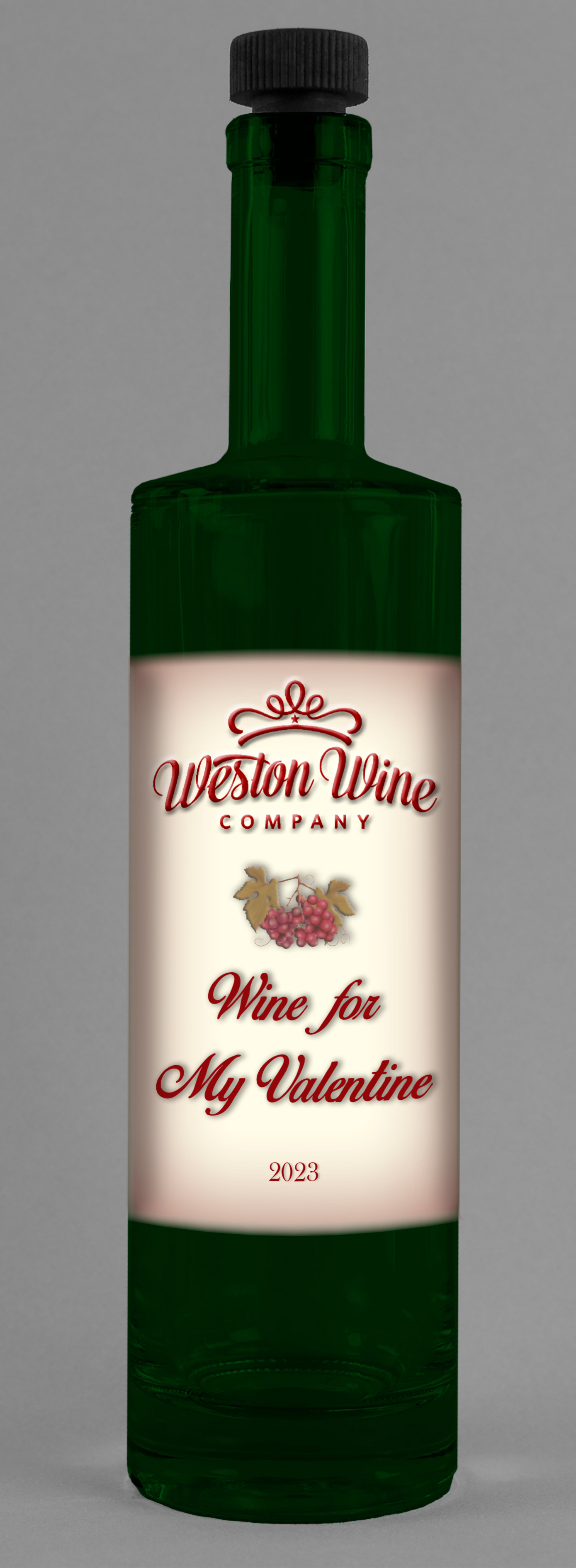
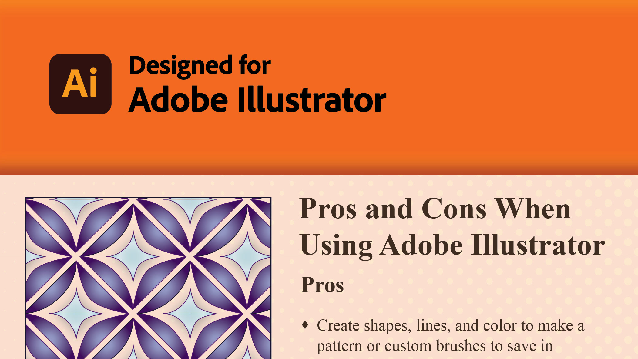
My design rationale included creating a rhyme to complement the holiday theme of poems and gifts. I created hearts and used the grapes in a pattern, along with making lattice lines as a repeating pattern. The box label matches the one on the wine bottle, ensuring the consumer knows precisely what is inside the box. I showed dielines and a glue knockout on the client mock-up to illustrate what the final box would look like when flat. Principles of design include repetition, spacing, contrasting color palettes, typography, and product packaging guidelines. This design message lets the consumer know this is special packaging for wine on a special day, to let someone know you love them.
Is this my best work? No, but I grew from the design and learned from the feedback provided by the client. My best work involves having the skills to create a new dieline for the special packaging. The mock-up helped every department in the finishing process, and we could use HCD testing to see where adjustments needed to be made. Creating packaging dielines requires special skills, including knowledge of setbacks, bleeds, knockouts, and glue areas.
If I could change anything, I would remove the overuse of the feathering effect, change the type of wine bottle, and create more contrast between the box background and foreground graphics. The client stated that the feathered look was too cartoony for their taste. They wanted it to have a more classy, elegant look. I would also add a tag area so consumers could write personal messages on the box.