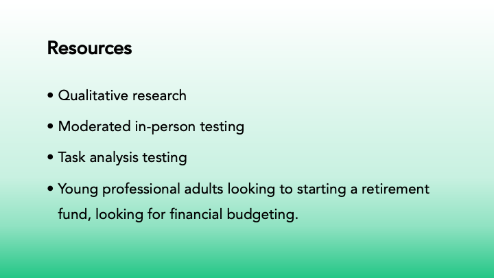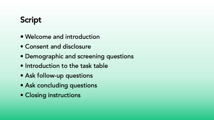
PowerPoint presentation discussing the process of UI/UX design and steps. This is a project for a fake company called Future Funds, targeting young professionals who want to start a retirement fund or gain better control over their finances. I have created a design using the company's brand style guidelines for color palette and logos. The client sent user feedback on the novice designer's submission, and I was hired to redesign the website and create landing pages for both desktop and mobile.
Novice Designers Submission
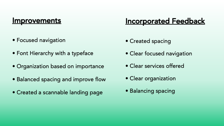
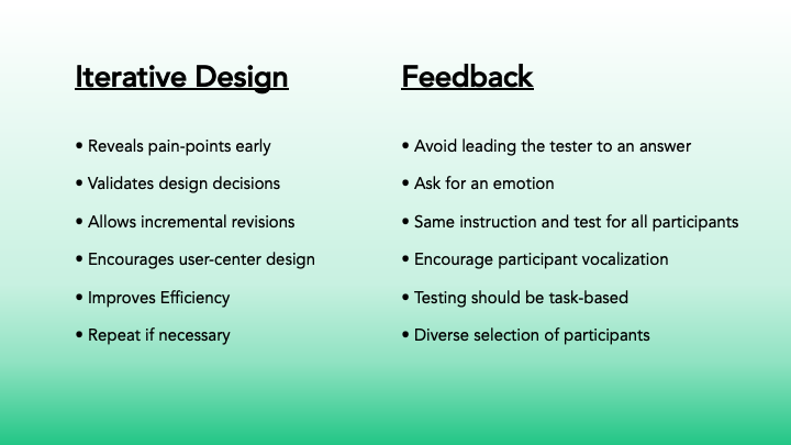
Users' feedback on the design left them confused; they felt the schedule area was in the wrong place and had too many entry fields. There were too many testimonials, and they were too far up. The "Who We Are" "What We Offer" and "Tools" sections were too far down the page.
My Future Funds Design Revision Presentation
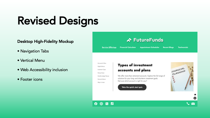
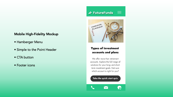
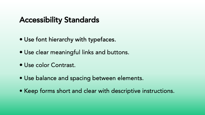
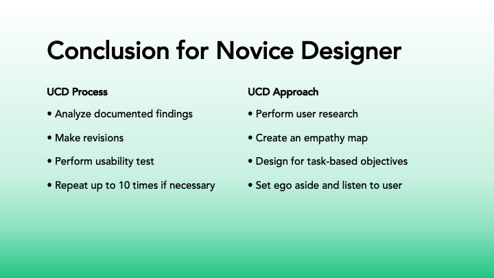
My revisions for Future Funds include using the client's brand color palette of green, black, and white. I created two landing pages for desktop and mobile. For the desktop versions, I made a static navigation bar with five topics, a vertical sidebar menu, a call-to-action button, and bottom buttons for social media and email. The mobile version has a logo and hamburger menu in the header, the main topic of the site with a call-to-action button, and communication button icons in the footer. Typography was improved by using a hierarchy of importance.